Homeownership comes with a lot to manage. Knowing where to start is the problem.
Tracking maintenance, planning improvements, and managing DIY projects can be overwhelming, especially for new homeowners.
ATCO wanted to create a product that helped people stay on top of the work that comes with owning a home, while connecting them to trusted services and products in a way that felt useful, not intrusive.

People needed guidance that matched where they were.
Homeowners didn't approach the same problems in the same way. Some were comfortable taking on projects themselves. Others needed more guidance, reassurance, or help from a professional.
The experience needed to account for that difference without allowing anything to feel heavy, or over-engineered.
Personalization worked best when it felt lightweight.
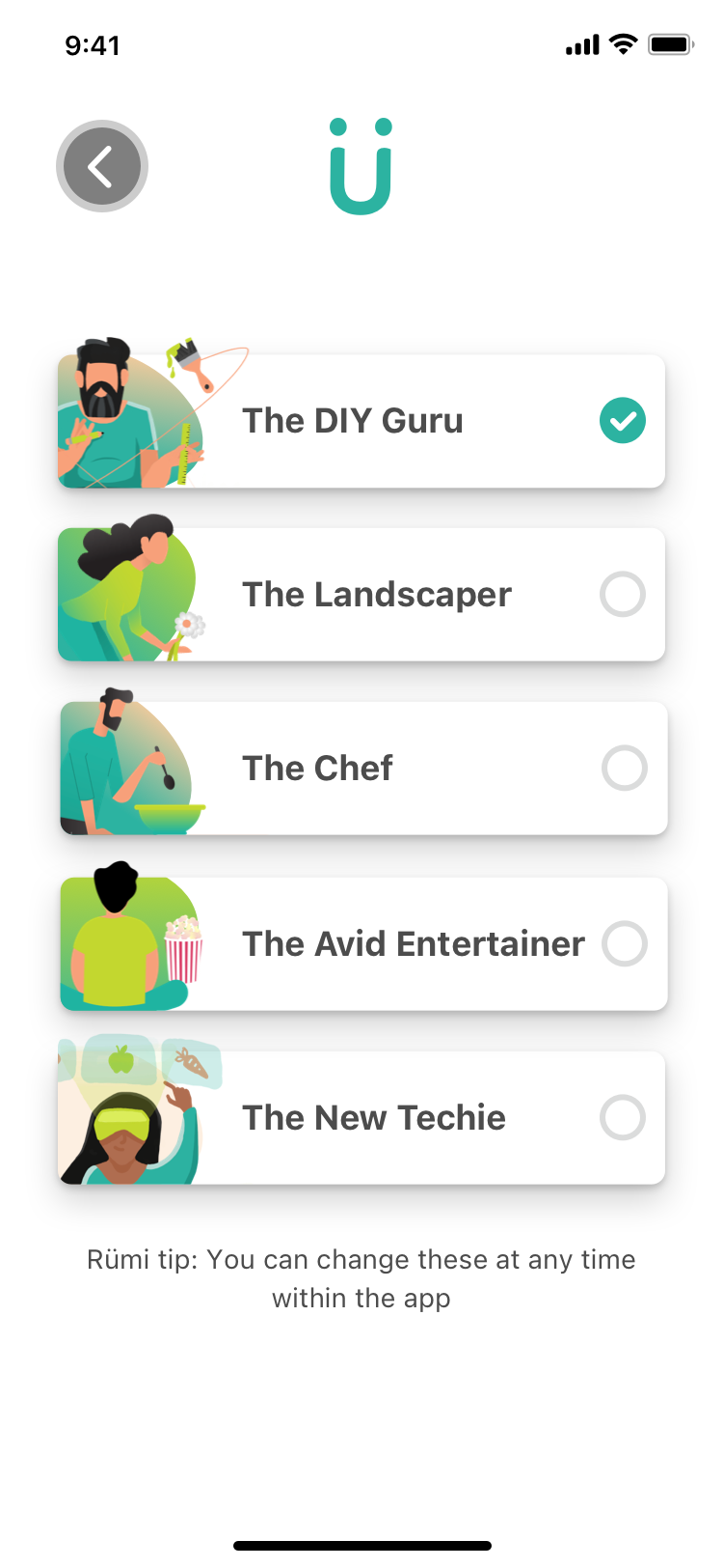
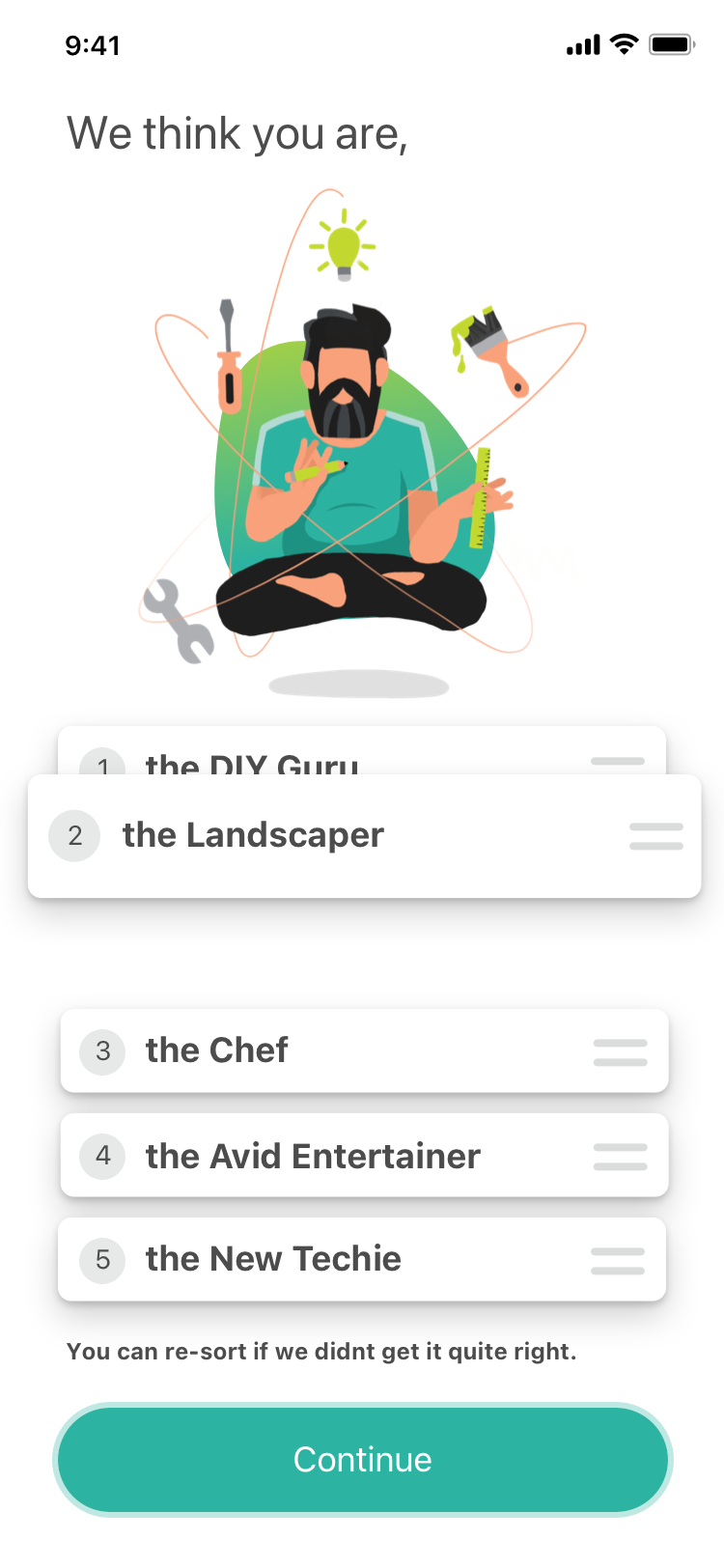
The persona selection gave users a way to define their comfort level, goals, and starting point up front.
That made it possible to shape the guidance around the person using the product, without forcing them into a rigid path or asking them to understand the whole system before getting value from it.
Early concepts tried to make it feel like a game. That wasn't the right direction.
Initial concepts leaned toward gamification, but it quickly became clear that homeownership isn't something people want to “win.”
Progress isn't linear. Maintenance is recurring. Priorities change. Turning that into points, scores, or rewards made the experience feel disconnected from how people actually manage their homes.
People didn't want motivation. They wanted clarity.
The stronger direction was not to make the product more playful. It was to make it more useful.
People needed to understand what needed attention, what could wait, and what action made sense next.

The solution was a system people could shape themselves.
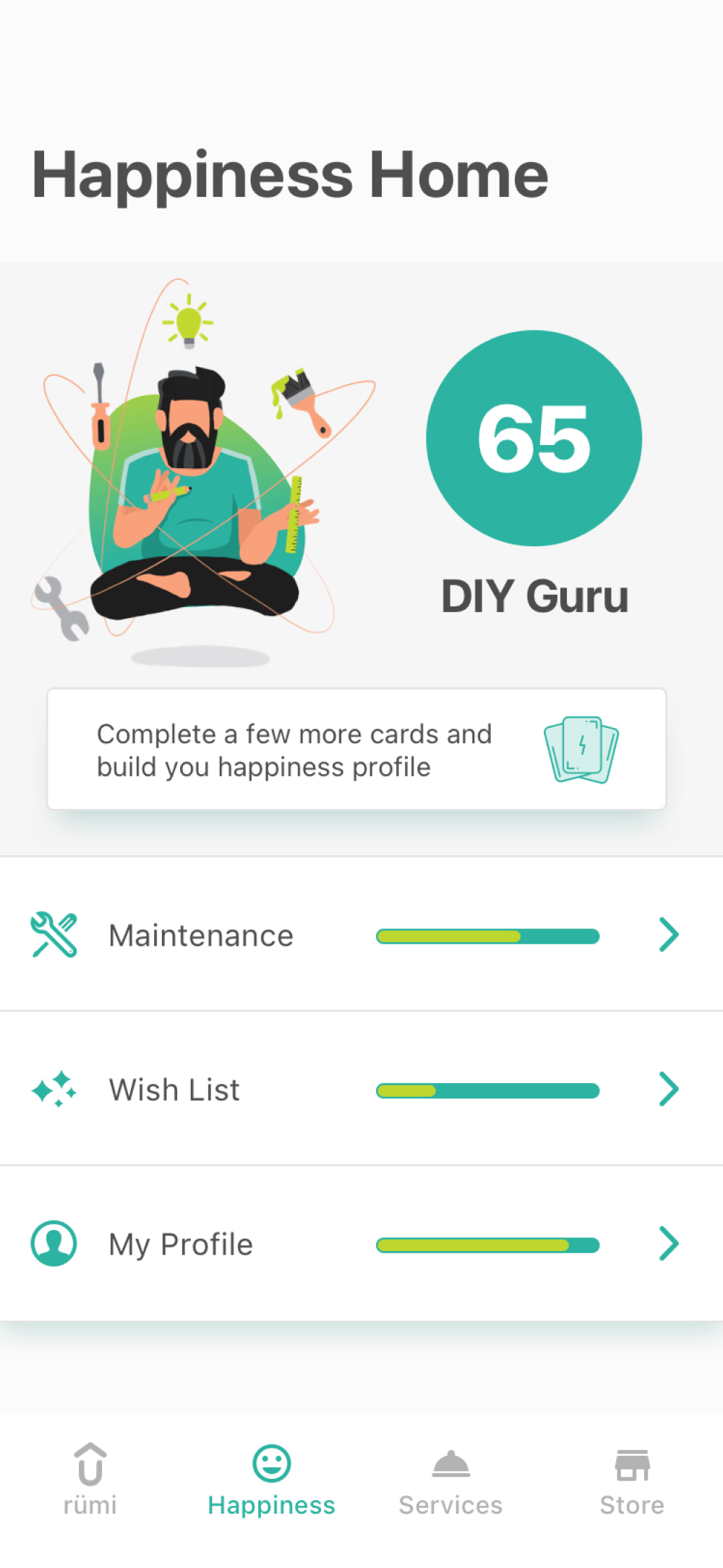
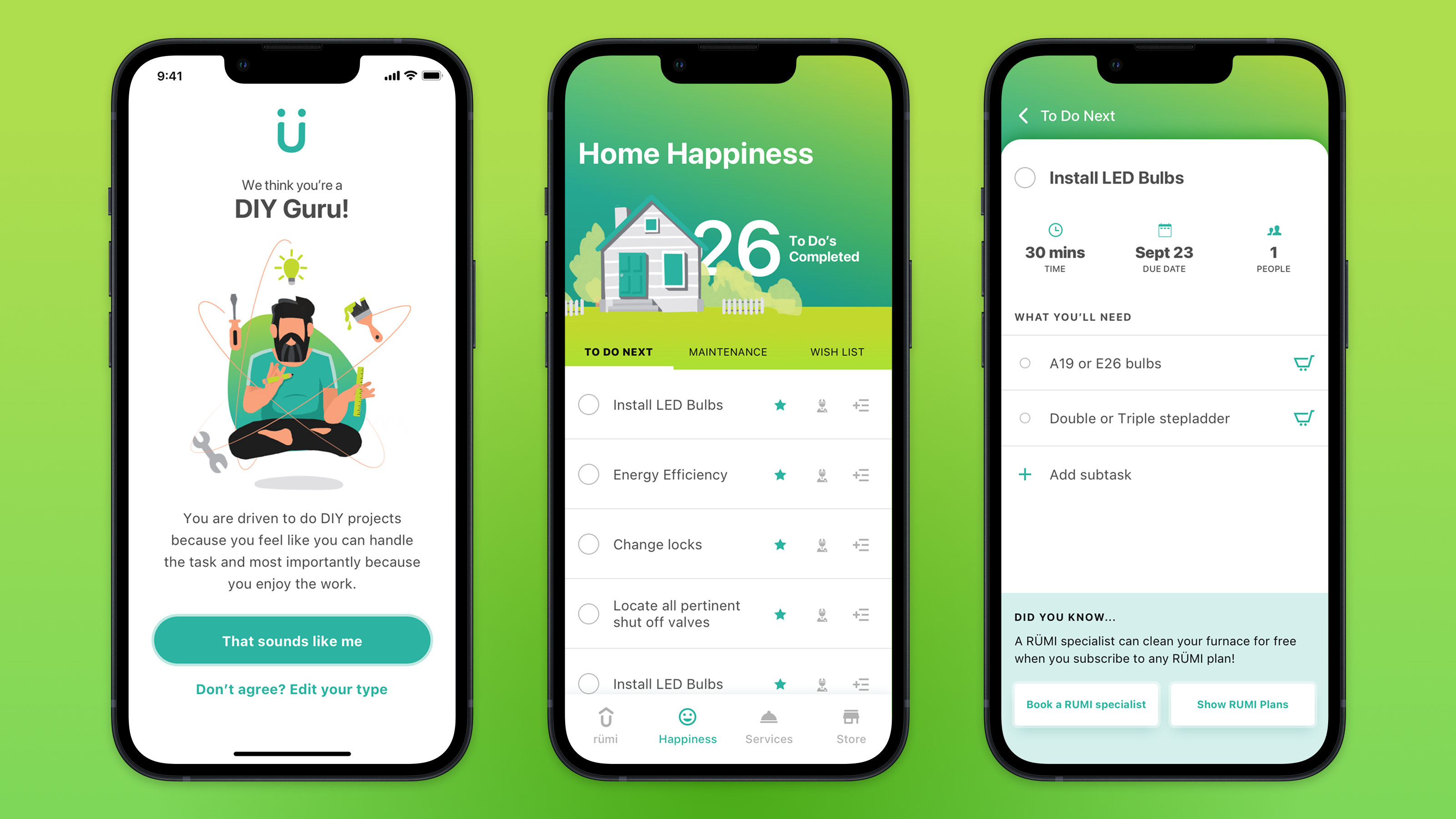
The experience shifted toward a flexible, user-driven checklist that organized tasks into three clear categories: what to do next, routine maintenance, and longer-term goals.
Users could prioritize, complete, or dismiss tasks, allowing the system to adapt to their workflow instead of forcing them into one.
Structure created clarity. Flexibility made it usable.
The goal wasn't to simplify homeownership. It was to make it easier to move through.
By giving people a clear structure without locking them into one path, the product could support different levels of confidence, urgency, and experience.
The experience became less about managing a list and more about helping people make progress.
Each task gave users more than a reminder. It gave them context, instructions, relevant supplies, and a way to connect with trusted professionals when they needed help. That mattered because the real gap wasn't between people and information. It was between knowing something needed attention and feeling ready to act on it.
Users could personalize the experience, organize tasks around their own priorities, and move from guidance to action without leaving the flow.
The core tension wasn't complexity. It was confidence.
Homeowners generally know their home needs work. What stops them is not knowing where to start, whether they're capable of handling it, or what doing it wrong might cost them.
The design reached a point where that gap had been directly addressed. Not by simplifying the work itself, but by making the path through it feel navigable. That was the problem worth solving, and the direction we landed on solved it.