The problem wasn't functionality. It was perception.
Terafina provides account opening software for banks and credit unions across digital, call center, and in-branch experiences. The platform supported a wide range of financial products, but growth had stalled.
The issue wasn't functionality. It was perception. The product didn't feel trustworthy, and it wasn't easy to use. That made it harder to sell, harder to adopt, and harder for applicants to complete.
Clarity was missing at every level.
The platform was built to be flexible and customizable, but the presentation layer hadn't evolved to support that. The result was a cluttered, inconsistent experience that made it hard for users to understand what they were looking at, let alone complete an application.
The platform was built to be flexible and customizable, but the presentation layer hadn't evolved to support that. The result was a cluttered, inconsistent experience that made it hard for users to understand what they were looking at, let alone complete an application.
The work focused on clarity, trust, and making the product easier to adopt.
The work focused on improving clarity, usability, and trust across the platform, while making it easier for clients to adopt and customize. That meant rethinking the presentation layer, simplifying application flows, and introducing a more flexible system for branding and configuration.
That meant rethinking the presentation layer, simplifying application flows, and introducing a more flexible system for branding and configuration.
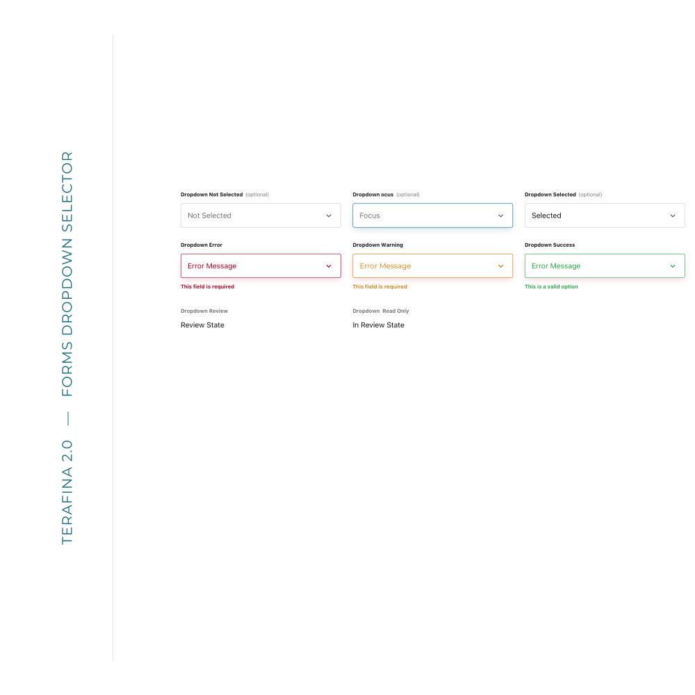
We started at the foundation and let the system scale from there.
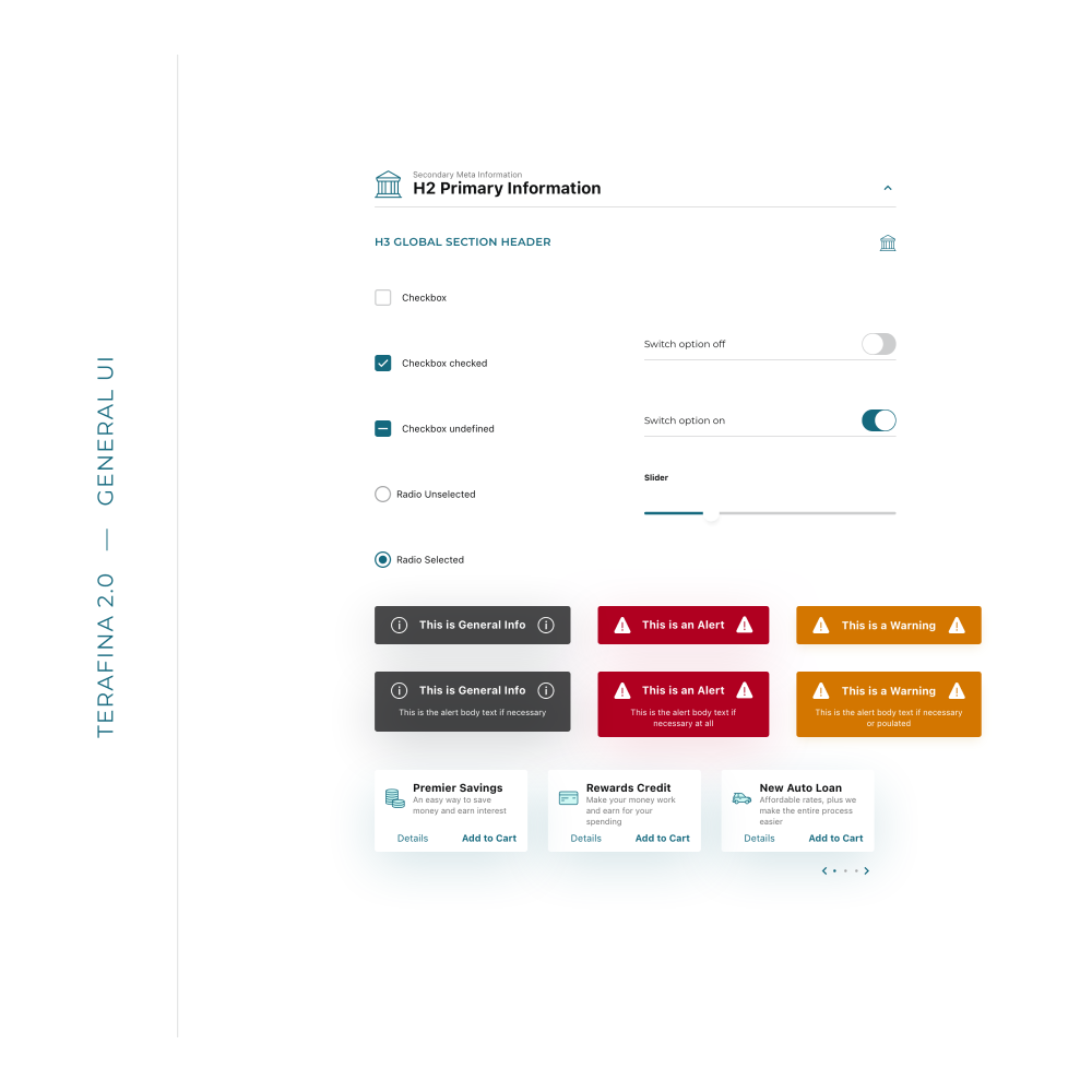
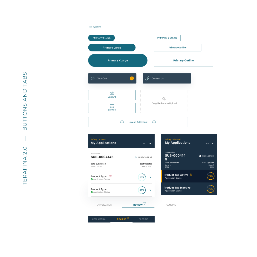
We started at the foundation. Instead of redesigning screens in isolation, I focused on rebuilding the system from the ground up, starting with atomic elements and letting those decisions scale across the product.
This made it possible to improve consistency, reduce cognitive load, and create a more cohesive experience without requiring a complete rebuild.
Small changes made the experience feel clearer, more guided, and more trustworthy.
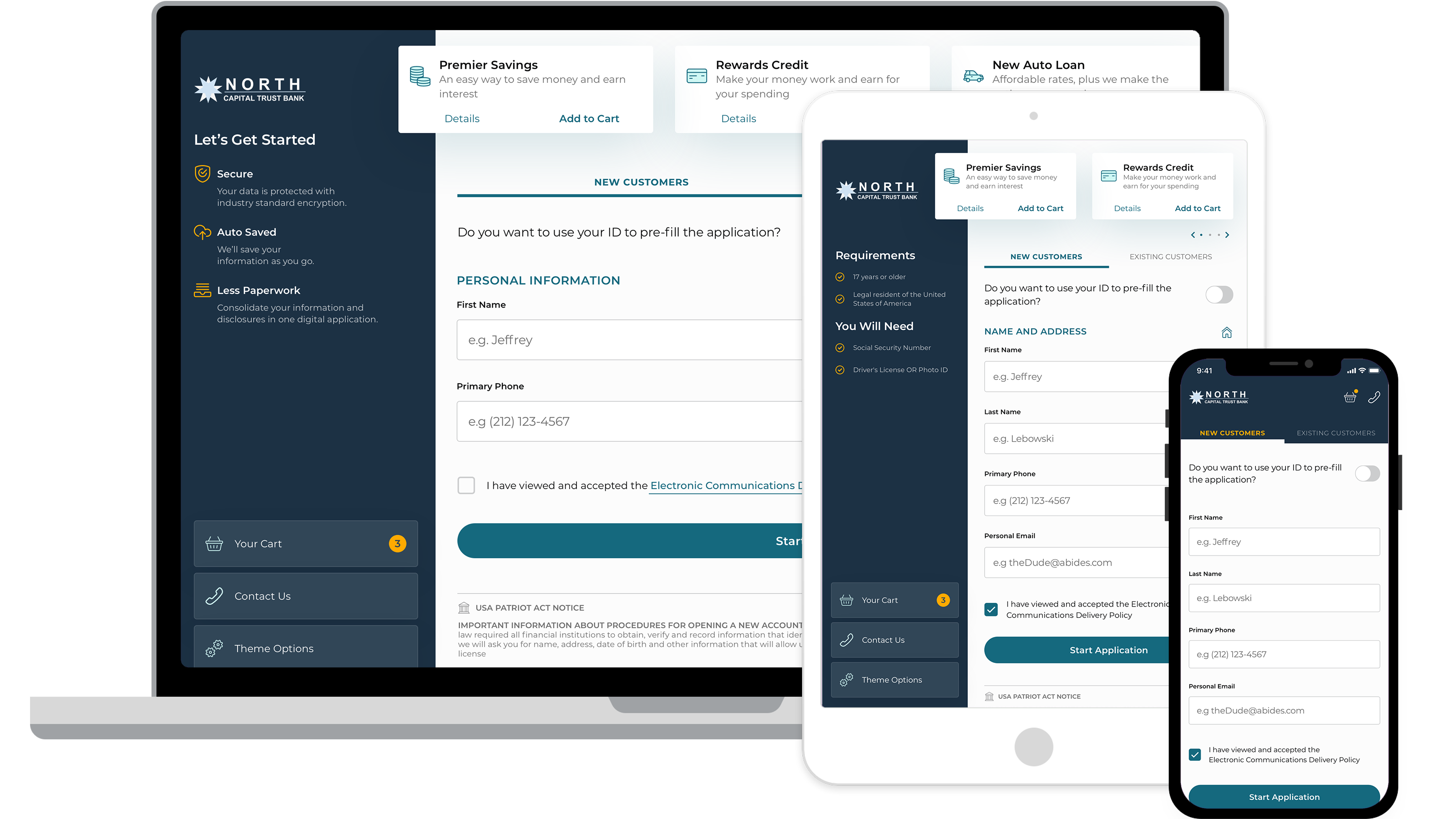
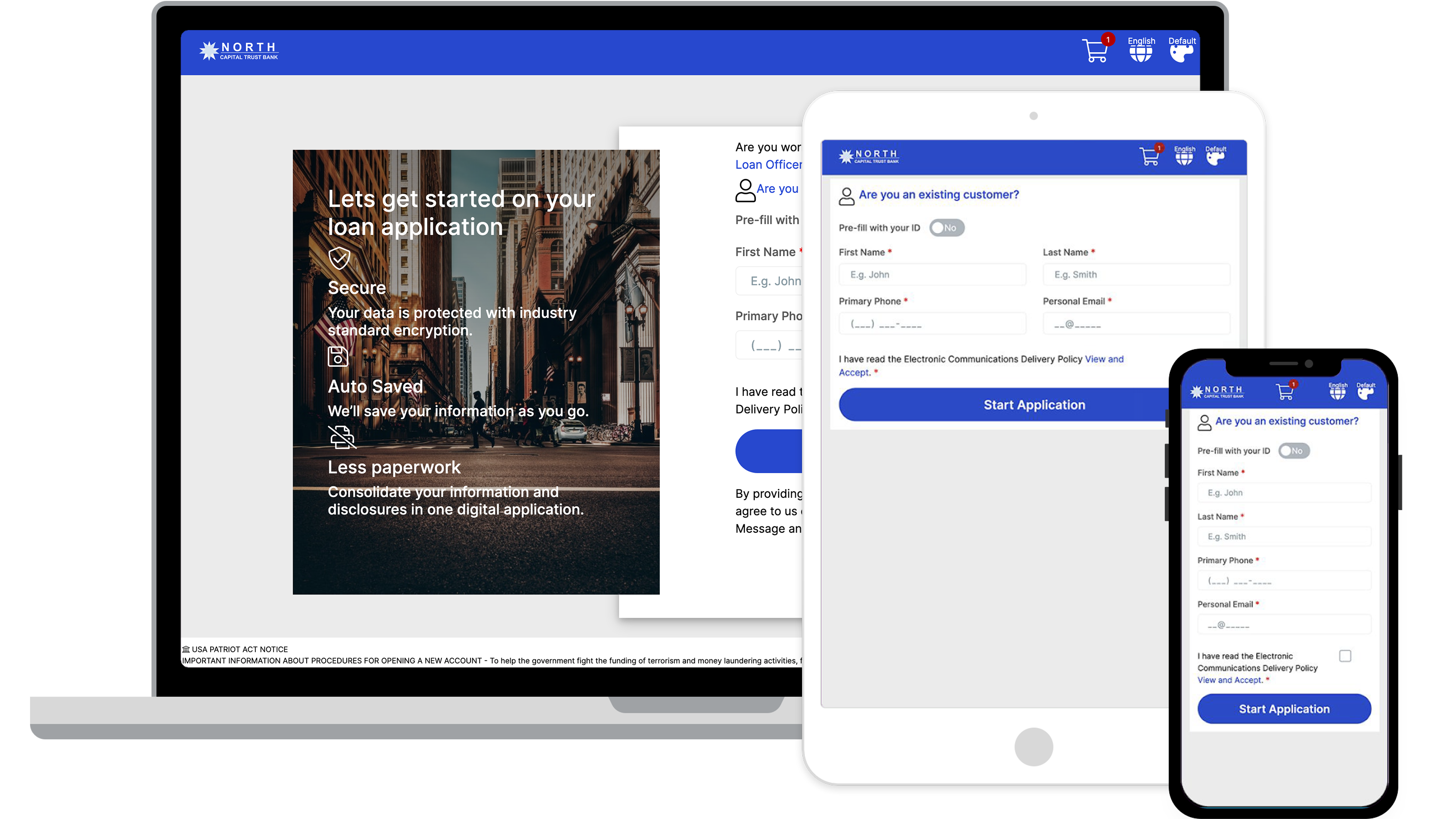
Application flows became clearer and easier to follow. A progress stepper was introduced across devices, giving users a better sense of where they were and what remained. Hierarchy and content were reworked to reduce friction, surfacing important information instead of hiding it and shifting the experience toward something more guided and approachable.
A white-label system made it easier for clients to apply their own branding without heavy development effort. This reduced implementation complexity, improved consistency across the platform, and made the product easier to adopt and scale.


The product became easier to use, easier to sell, and easier to adopt.
The platform became easier to understand, easier to use, and easier to sell, giving both users and clients more confidence in how it worked.
Reducing cognitive load and improving consistency led to a measurable decrease in application abandonment, with completion rates improving by 12%.
The introduction of a flexible branding system made the product more accessible to new clients, supporting adoption without increasing implementation complexity.